A beacon of excellence in the digital marketing realm. Our mission is simple yet profound: to guide businesses towards unparalleled growth in the digital sphere.
With a bespoke approach, we offer a spectrum of services meticulously tailored to your unique requirements. Collaborating with industry luminaries, we craft personalized experiences that transcend expectations.
Embark on a transformative digital journey with us, where your online presence is not just amplified but empowered. Our arsenal of captivating strategies ensures that your brand not only stands out but thrives in the ever-evolving digital landscape.
At Techmize, we specialize in an array of services, including website development, social media management, Facebook and Google ads, graphic designing, search engine optimization, branding, and business consultation. With us by your side, your digital aspirations are not just realized but elevated to unprecedented heights

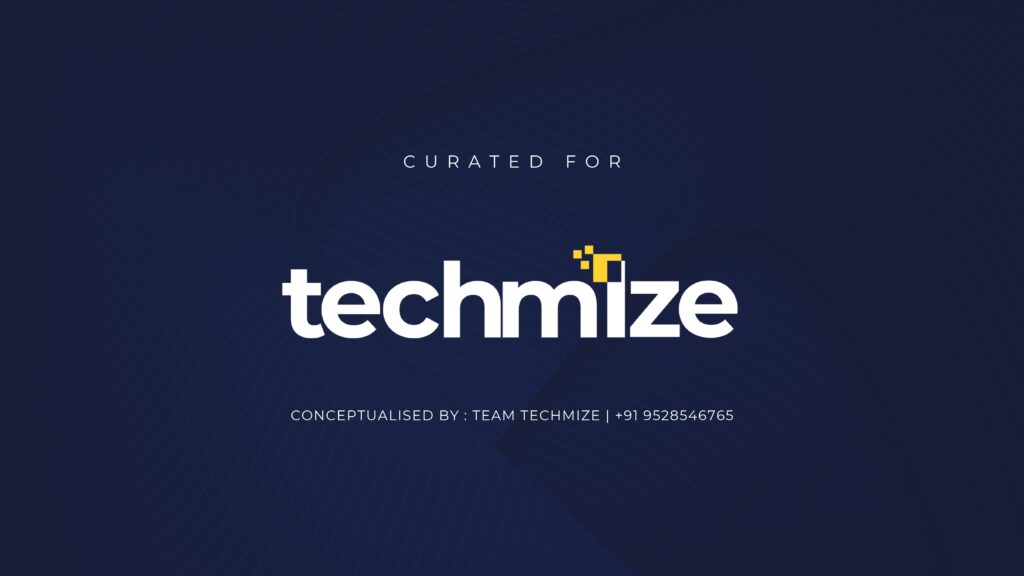
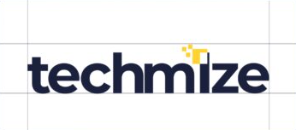
Our logo embodies simplicity & sophistication, featuring clean typography with a clever twist. The letter “i” is ingeniously crafted to showcase pixels, symbolizing our mastery in the digital realm.
Pixels are the building blocks of the digital world, representing the intricate details of ads, creatives, and online campaigns.
With our pixel-inspired logo, we signify our commitment to precision, innovation, and cutting-edge strategies in digital marketing.
At Techmize, we harness the power of pixels to craft compelling narratives, captivating visuals, and impactful campaigns that resonate with audiences worldwide. Our logo is not just a symbol; it’s a testament to our dedication to excellence and our relentless pursuit of digital mastery.
With a palette of Navy Blue, Yellow & White, each shade has a unique significance in the world of digital marketing and growth.
* Navy Blue represents trust, stability & professionalism, qualities that are essential in building strong relationships with our clients and partners. It symbolizes the foundation of reliability and expertise that we bring to every project.
* Yellow, on the other hand, evokes feelings of energy, positivity, and innovation. It’s the color of creativity and fresh ideas, reflecting our approach to crafting dynamic strategies that propel businesses forward in the digital landscape.
* White embodies clarity, simplicity, and purity. It represents the transparency and honesty that we uphold in our interactions with clients, ensuring clear communication and mutual understanding every step of the way.

For our digital marketing agency, the Montserrat font family emerged as the perfect fit. Its clean, minimalist, and corporate attributes seamlessly align with our aesthetic objectives
.The sleek lines and contemporary simplicity of Montserrat not only convey professionalism but also guarantee readability, essential for a logo representing a marketing agency. This font family effortlessly embodies our dedication to a polished and modern identity, making it the ideal typographic companion for a logo that aspires to be both stylish and corporate.
Aa Bb Cc Dd Ee Ff Gg Hh li Jj Kk LI Mm Nn Oo Pp Qq Rr Ss Tt Uu Vv Ww Xx Yy Zz 1234567890 !@#$%^&*)
Aa Bb Cc Dd Ee Ff Gg Hh li Jj Kk LI Mm Nn Oo Pp Qq Rr Ss Tt Uu Vv Ww Xx Yy Zz 1234567890 !@#$%^&*0
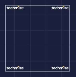
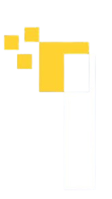
This intentional breathing space ensures that the logo maintains its integrity and impact, even in crowded visual environments.
By incorporating exclusion zones, we guarantee that the logo remains legible and visually powerful, whether displayed on apparel tags, digital platforms, or promotional materials. This thoughtful approach not only preserves the logo’s clarity but also enhances its recognizability, contributing to a consistent and professional brand image.