Your Website in Your Pocket
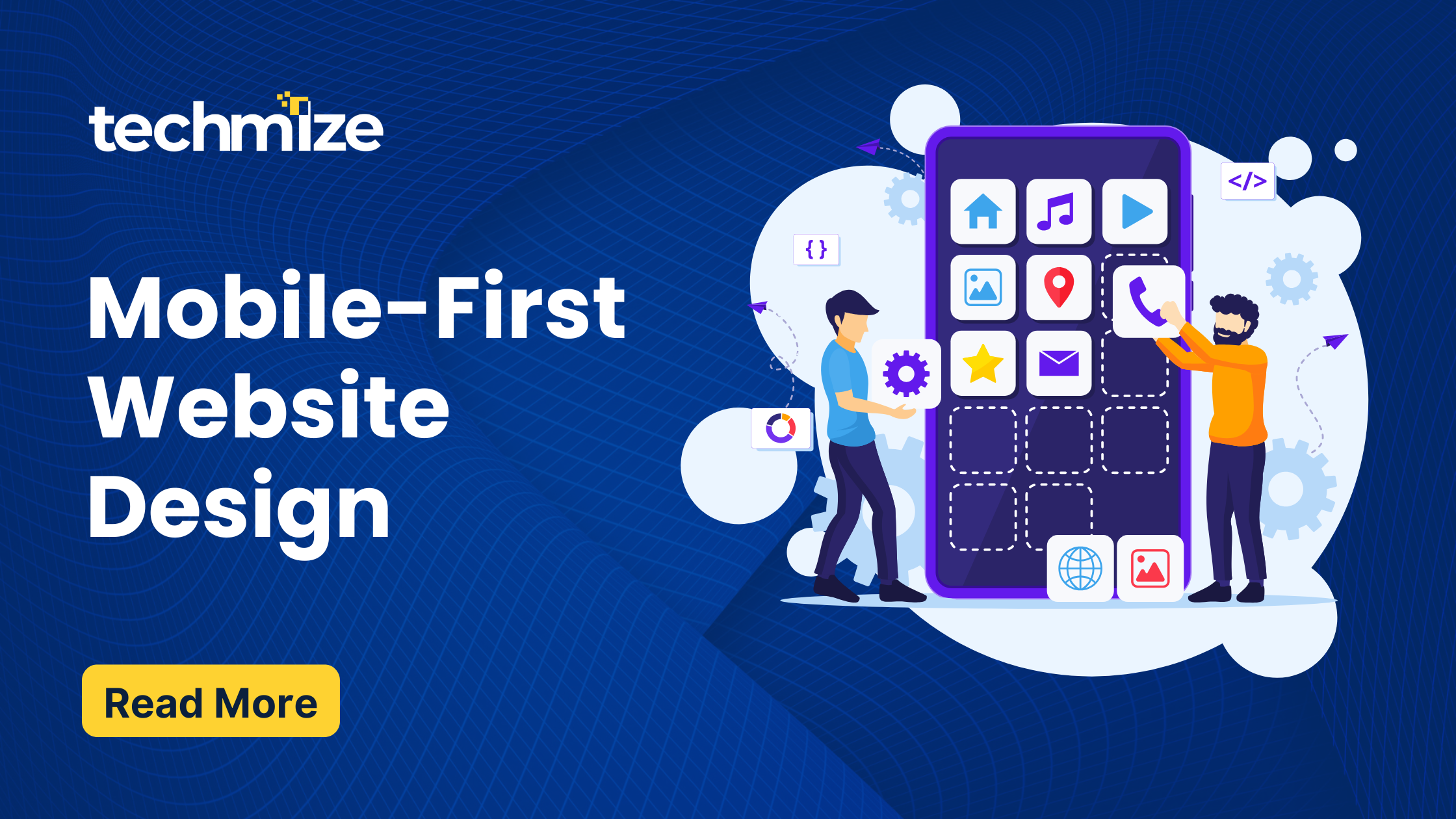
Okay, let’s talk about websites. You know, those things you look at on your phone or computer. Now, think about how often you use your phone to go online. Probably a lot, right? You’re not alone. Most people use their phones to browse the internet more than their computers. That’s why making websites that work great on phones is super important. We call this “Mobile-First Website Design“.
Why Start with Phones in Mobile-First Website Design?
Imagine you’re building a house. Would you start with the roof and then try to fit the walls underneath? No, you’d start with the foundation. That’s what Mobile-First Website Design is like. You start with the smallest screen, the phone, and build your website from there. This way, you make sure it works perfectly on phones first, and then you can make it look good on bigger screens like tablets and computers.
Why is this a good idea?
- Everyone’s on Their Phones: Like we said, most people use their phones to go online. If your website doesn’t work well on phones, you’re missing out on a lot of visitors.
- Happy Users: A website that’s easy to use on a phone makes people happy. They can find what they’re looking for quickly and easily.
- Google Likes It: Google, the search engine, likes websites that work well on phones. So, if your website is mobile-friendly, it’s more likely to show up higher in search results.
- Future-Proof: Phones and technology are always changing. If you start with a mobile-first approach, your website will be ready for whatever comes next.
Making Mobile-First Website Design That Change Shape: Responsive Design
Now, how do we make a Mobile-First Website Design look good on all different screen sizes? That’s where “responsive design” comes in. Think of it like a shirt that stretches to fit different sizes. Responsive design makes your website change its shape and size depending on the screen it’s being viewed on.
How it works:
- Flexible Layouts: Instead of using fixed sizes, the website uses percentages. This means things can stretch and shrink to fit the screen.
- Changing Images: Images also change size so they look good and don’t slow down the website.
- Special Rules: The website uses special rules (called “media queries”) to change how things look based on the screen size.
Making It Easy to Touch: Touch Targets
When you’re using a phone, you’re using your fingers to touch the screen. That’s why it’s important to make things easy to touch. We call these touchable areas “touch targets.”
Some tips:
- Make Buttons Big: Small buttons are hard to tap. Make them big enough for fingers to easily touch.
- Give Space: Don’t put buttons too close together. This helps prevent people from accidentally tapping the wrong thing.
- Clear Buttons: Make sure buttons look like buttons, so people know they can tap them.
Swiping Around: Swipe Gestures
Swiping is a natural way to use a phone. You swipe to scroll through pictures, move between pages, and more.
How to use swipe gestures:
- Picture Slideshows: Use swiping to move through picture slideshows.
- Easy Navigation: Use swiping to move between sections of your website.
- Show Movement: When someone swipes, show them that something is happening, like a slight movement of the screen.
Fitting on All Screens: Optimizing for Different Sizes
Phones and tablets come in all shapes and sizes. So, how do we make sure our Mobile-First Website Design looks good on all of them?
- Put Important Things First: On small screens, show the most important information first.
- Simple Menus: Use a simple menu that’s easy to use on a small screen.
- One Column: Use one column of text, so it’s easy to read on a phone.
- Small Pictures: Make sure pictures are small enough to load quickly on phones.
- Test It Out: Check your website on different phones and tablets to make sure it looks good.
Making It Fast: Performance
Nobody likes a slow website. Especially on phones, where internet connections can sometimes be slow.
How to make your website faster:
- Small Pictures: Use small, compressed pictures.
- Less Stuff: Don’t load too many things at once.
- Use Caching: Store parts of your website on people’s phones, so they don’t have to load them every time.
- Check Speed: Use tools to check how fast your website is and find ways to make it faster.
Keep It Simple: User-Friendly Tips
- Easy Menus: Keep menus simple and easy to understand.
- Short Sentences: Use short sentences and paragraphs.
- Use Lists: Use bullet points and lists to make things easier to read.
- Don’t Use Too Many Pop-ups: Pop-ups can be annoying on phones.
Always Improving: The Mobile-First Way
Mobile-First Website Design is not something you do once and forget about. It’s something you keep working on. As phones and technology change, you’ll need to keep updating your website.
Remember, the most important thing is to make your website easy and enjoyable to use on phones. If you do that, you’ll have happy visitors, and your website will be a success.
At Techmize , we aim to empower businesses by offering cutting-edge Trends in Website Design, Landing Page Design, and Redesign Services .Our solutions are tailored to captivate your audience, boost conversions, and bring outdated websites back to life with modern aesthetics and functionality. Partner with us to elevate your online presence and achieve your business goals seamlessly.
Ready to take your digital journey to the next level? Connect with us today and discover how our services can transform your online strategy into a powerful growth engine. Let’s create something extraordinary together!